30 min discovery callGrab a call
Grab a call
with us
Pick a day. You'll choose the time on the next screen.
Comrie Building Services, Melbourne
Comrie Building Services. Commercial roofing and cladding across Melbourne, with a crew that's loud, bold and good at what they do.

Every commercial roofer looked the same.
None of it looked like the people actually up on the roof.
We stopped trying to look like a roofing company and leaned into the crew instead. Comrie became less of a brand and more of a show. Real people, real culture, zero polish.
Where it started. We asked Comrie why they came to us. This is what they said.
We came to you guys because we didn't want to look like any other roofing company. We wanted to look like a roofing company no one has ever seen before. We want shock value, something that represents us as people. We're loud on site, loose, larrikins, and we love what we do. We're a family-run business, and our culture is what matters most to us.
Comrie, on the discovery call
Walking the line between professional and feral.
Ditch the roofing playbook. No stock photos of blokes on ladders. No "quality you can trust". Capture the gritty moments on site, the stuff no other roofer shows you, and make images that stop the scroll. Invoices and the website still get to be clean. For the squares.
Capture the gritty moments of the building site.
Provocative images that stop the scroll.
Lean into doing the gritty work.
Not scared to show personality. Celebrate it.
Balance that art deco feel without playing it safe.
A dysfunctional building company
that's completely functional
Capturing the grittymoments of the building siteProvocative images that stopthe scrollA brand that leans intoDoing the gritty work.Not scared to show personality.Celebrate it
The strategy, one page.
Notes
Walking the line betweenprofessional and feral.Ditching the typical roofingplaybook entirely. No stockimages of blokes on ladders. No"Quality you can trust." Justraw, unapologetic creative thatmakes people stop and actuallylook at a roofing brand for once.
The notes that set the rules.
Imagery provocative.More capturing the dirty moments on site.The stuff that no other company shows you.Everything is super rough.Balancing that art deco without playing it safe.Invoicing. Web. Other documents still have a time and place to be minimal.(For the squares)
Imagery notes. Everything super rough, on purpose.

Round one moodboard.

Where the silicone idea showed up.
Every roofer was looking clean and polished. We leant into the grit, and celebrated it.


Round one was rough on purpose. Big condensed type, an urgent red palette and a clean wordmark. Then two logo directions went to Ashley. Clean-ish, and blurred. Blurred won and ended up squeezed out of a caulking gun.

ExploredRound one. Extremely rough.

ExploredRound one ad ideas.
We played with the elements to make sure the brand held up. Big bold fonts, the imagery style, and a rough look at it on merch for the crew who'd actually wear it. We always mess with layouts, colours and textures to make sure we're heading the right way.

KilledClean wordmark with attitude.

KilledClean-ish direction.

KeptBlurred and gritty. The dysfunctional one.


Started with an urgent red. Landed on Comrie Orange, Offblack and Silicon White, the colour of a fresh bead of silicone. Loud on site, easy on paperwork.
Click a colour to copy it.
The wordmark is custom, drawn like a bead of silicone. Everything around it runs on two typefaces. GC Vank shouts the headlines, always in capitals. Inter Medium does the quiet work.
WE KNOW EXACTLY WHAT TO DO WITH LEAKS.
Body copy does the quiet work. It sits under the loud stuff and gets out of the way, so a roof report still reads like a roof report.
IF IT LEAKS,
CALL US.
GC Vank on top, Inter Medium underneath. That's the whole system. Loud where it counts, easy to read everywhere else.
The Sheetheads came straight out of the strategy call. The crew got called a bunch of shit heads on site. Swap one letter, you get Sheetheads. Roofing sheets with a head on them. It stuck so hard one of their mates got it tattooed.


The range, and one Sheethead that's on there for life.


Roof reports and quotes are usually the most boring thing a roofer sends. We wrote them like the crew talks. Dry, cheeky, a bit smug.
We have many problems, and your roof is one.
The time it took to write this report, we could have fixed it by now.
Roof report. Because you asked for it.
This quote won't leak. Just like our work.
You can stop looking now.


Quote covers. Every one of them tells you to open it.
Everything locked into one guide so the brand stays the brand, whoever picks it up next. Logo, colours, type and the merch rules.
We can't show you too much more. Sorry!


The merch page. Locked artwork, no skewing.

One mark, loads of moods. A scalable set of wordmark variations.

Every approved colour combo for the wordmark, straight from the brand guide.

And what not to do.
Hutt Built, Lakes Entrance

Hutt Built. Custom homes, tiny homes and renos out of Lakes Entrance. Organic materials, artists for clients, and a crew that takes its time.

Dan and the crew, on the tools.

A few of their builds. Timber, curves and a lot of care. Tap to zoom.
A shiny chrome badge for a builder who works with raw timber and artists.
It looked like it belonged on a hot rod, not a hand-built home on the lake. And the rest of the coast wasn't much better. Generic builders, no story, no personality.


Where they started, and where they landed. Drag it.
Where it started. We asked Dan why he came to us.
We're a builder from Lakes Entrance. We work a lot with organic materials and custom-made homes, and with a lot of artists and creatives. Think cool folk, very artsy. I love my surfing. We're a pretty laid-back building company, taking our time and getting it done right. I just need something that really reflects all of that, if that's possible.
Dan, on the discovery call
We're not selling building services. We're selling the feeling that what you live in reflects who you are.
Hutt isn't a builder for everyone. Their clients are artists, chefs, brewers and makers. Circus performers turned yoga masters. People who already live with intention and need a builder who can actually pull off their vision.

The real clients. Makers, chefs, brewers and artists. Tap to zoom.
Build places for people to connect.
A good to be here feeling.
Take the time most builders won't.
Think like a creative. Build like an artist.
For people who'd rather get it done beautifully than whip it up. Against the volume builders rushing jobs to hit a deadline.
Warm but direct. Like a mate who really knows their stuff. Calm and confident without being loud about it.
Personality
Tone of voice
“We ask a lot of questions before we pick up a tool. Drives some people mad. The right ones get it.”
Warm, earthy, a bit hand made. More negroni than VB.
Natural type with soul, an earthy palette, and photos that feel found, not styled. Think Rose Pink Cadillac by Dope Lemon.

Moodboard 01, straight from the strategy deck. Tap to zoom.

The sensory vision board. Warmth where the light hits.

Brand feel. Timber, workshops and makers.
First direction. Five routes, all warm, all a bit hand made.
We drew five routes and dropped each one onto a real space to see how it felt.


ExploredC.1 to C.4. Timber rings, a stencil, a chunky full stop and a hand-drawn "built".

KeptC.5. The closest version to the one that landed.
HUTT. for everything, and the H for the tight spots. Caps, beanies, avatars.
A builder brand that doesn't look like a builder.
No roof in the logo. No hammer. No “quality you can trust”. HUTT. looks as at home on a floating restaurant or a tote bag as it does on a site sign. Exactly the world their clients live in.
Four colours pulled from timber, stone and the lake at golden hour.
Tap a colour to copy it.
Tap a combo. Every one of these is signed off in the brand guide.
Three typefaces. Graphite for headlines, Archivo for sub heads, Archivo Expanded for body copy.
HUTT BUILT
We ask a lot of questions before we pick up a tool.
Some of our best work nobody ever sees. It's in the walls.
GOOD TO BE HERE


Coal and Walnut.

The full range, locked in the guide. Tap to zoom.
The crew at the saw bench, drawn by hand and dropped over the real thing.

Chocolate hoardings with the H front and centre. Hard to walk past.


Everything locked into one guide so the brand stays the brand, whoever picks it up next.

Two approved avatars for socials, one dark and one light.

Every approved colour combo, straight from the guide.

And what not to do.
This is all we can show you. Sorry.
A builder brand that finally looks like the homes they build. Warm, a bit hand made, and in no rush.
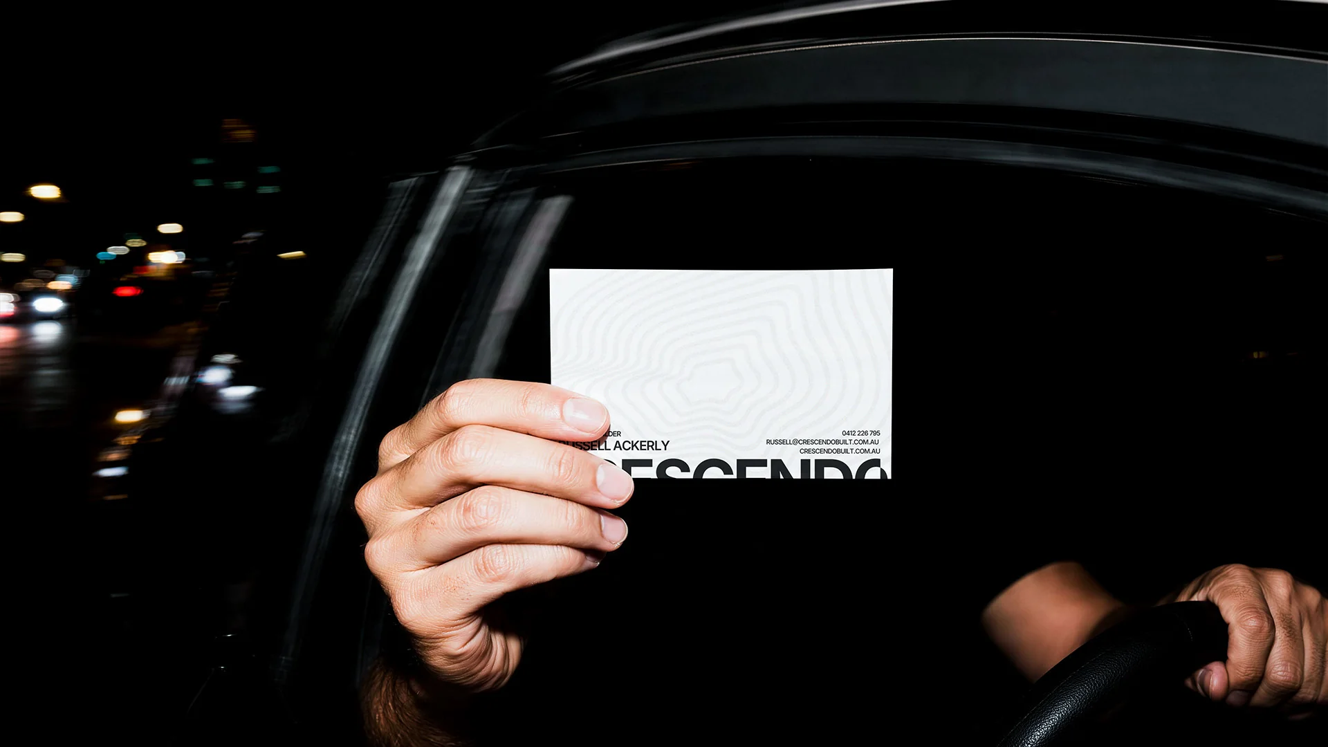
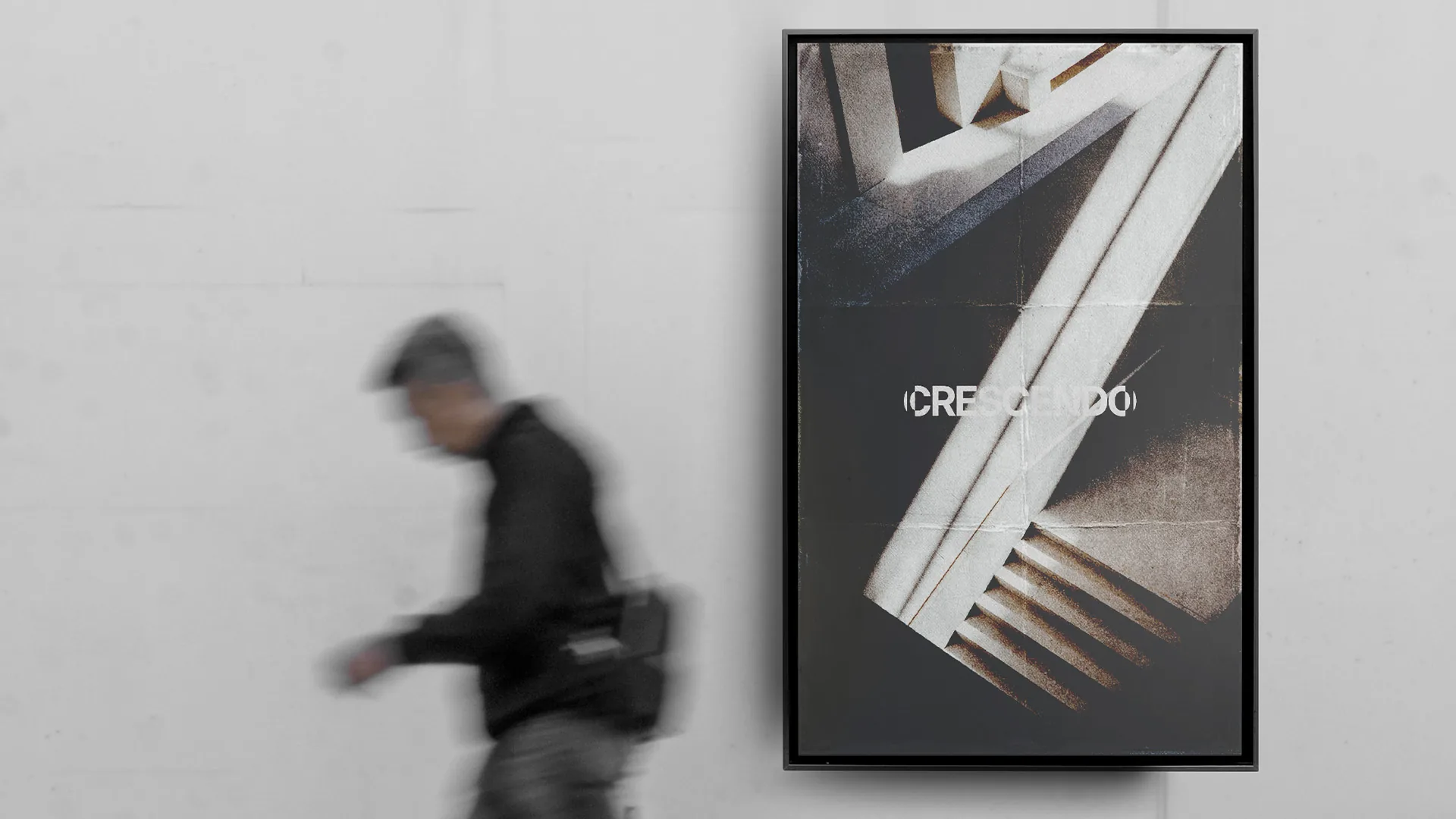
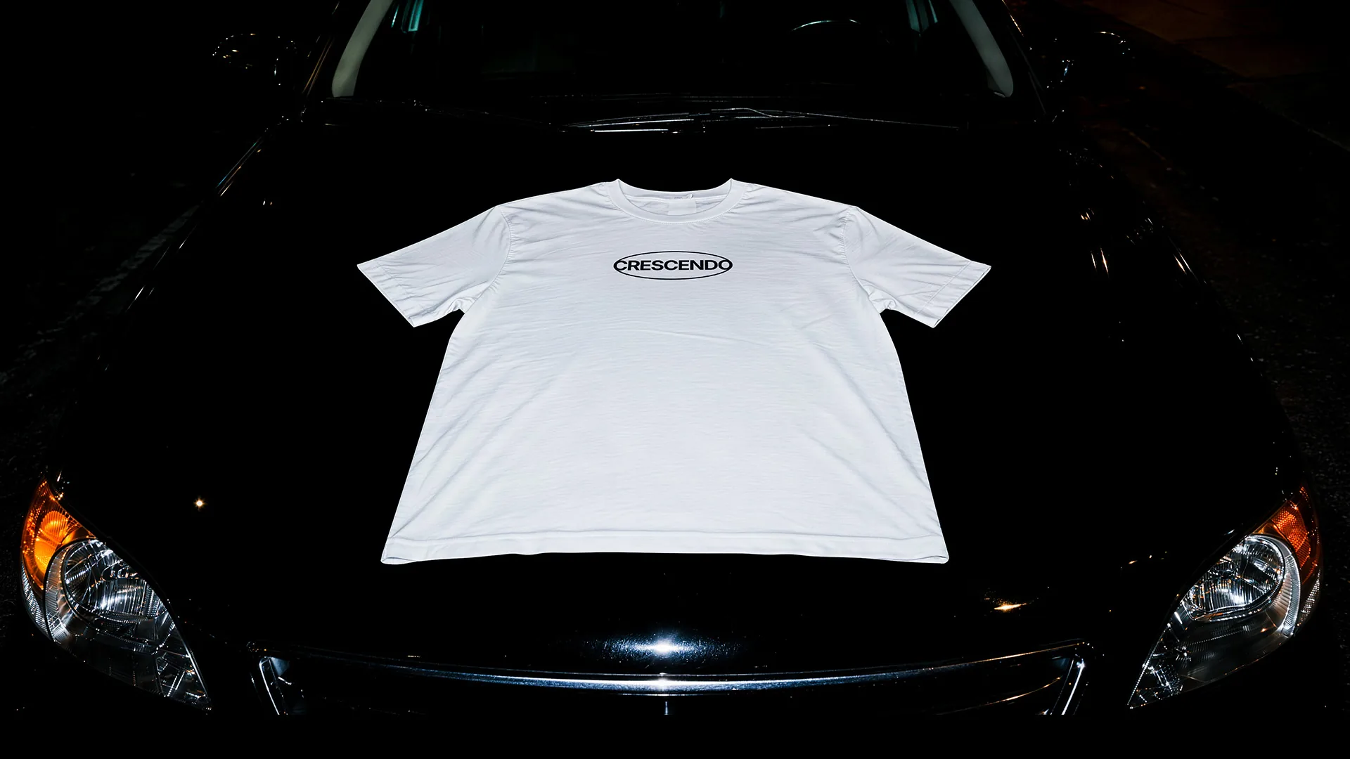
Crescendo Built
"Crescendo, in a music sense, is the best bit. The build up. The pinnacle everyone likes."Russell Ackerly, Crescendo Built
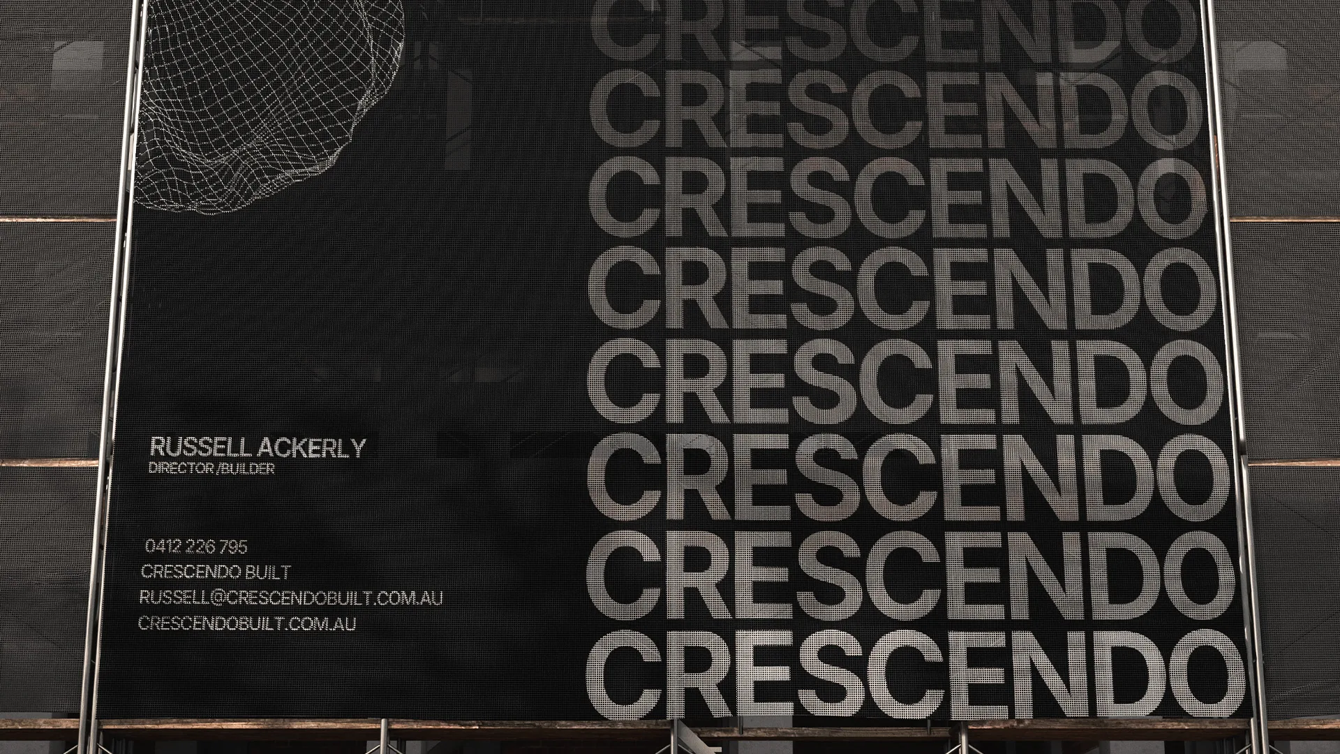
Crescendo Built. Not reinventing the wheel. Just good builds.
I build mainly for the rich, but I do it for my family.
I have a passion for building sick shit.
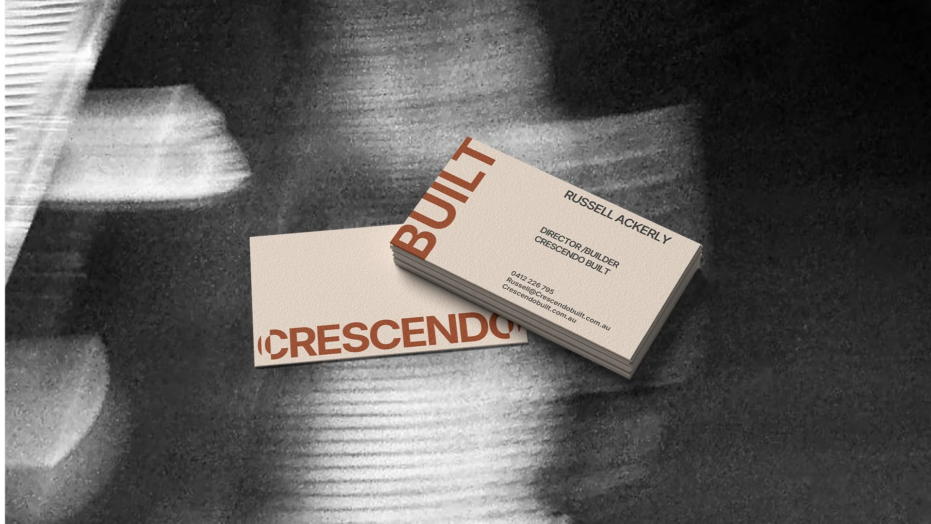
Warm. Intelligent. Premium. Approachable, but a serious building company.
They weren't trying to out-shout anyone. They just wanted a brand they're proud to put their name to.
I'm not trying to reinvent the wheel.
I'm just an honest guy that does what he says he will do.
They might be expensive, but they're damn good.
Drawn to rhythm and movement.
Progression, like the building industry.
Not trying to be something they're not.
A wow factor, like walking into your new home.
Minimal, but with personality.
Like a conversation with a mate.
Nothing too dark and serious.
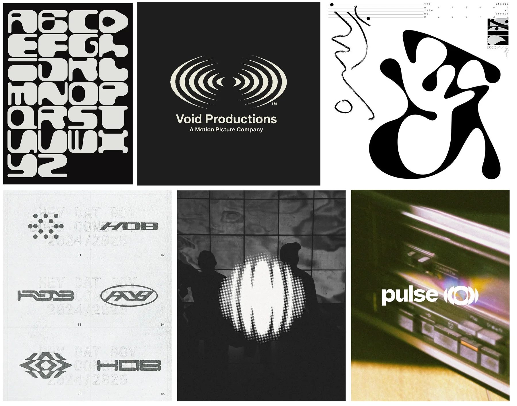
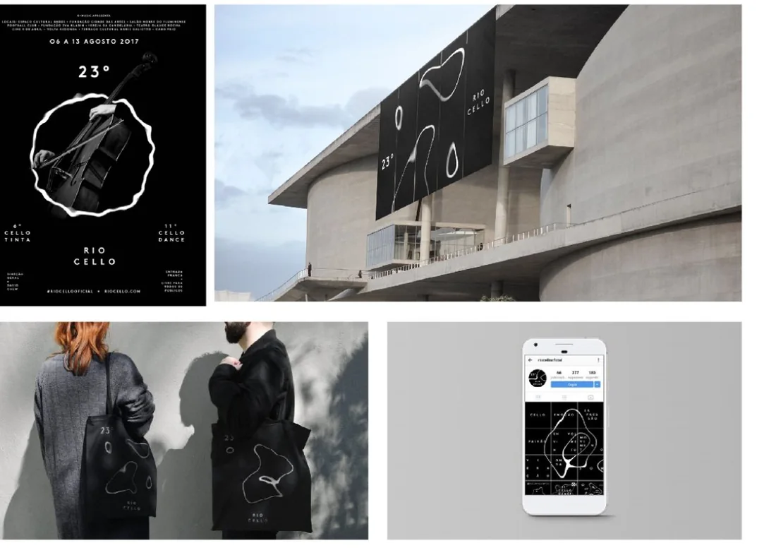
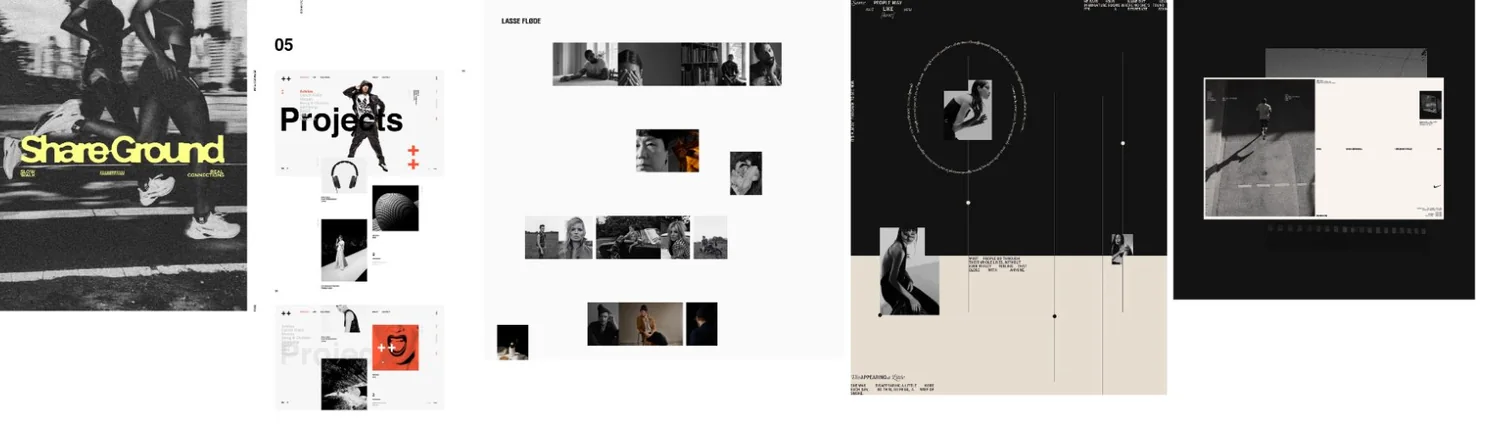
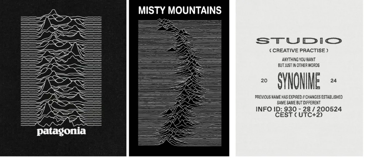
An identity that had to have rhythm.
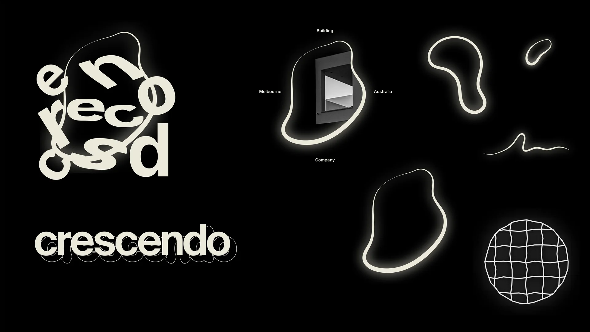
We wanted to push the minimalism, and see if the brand could show up a bit more architectural and fun.
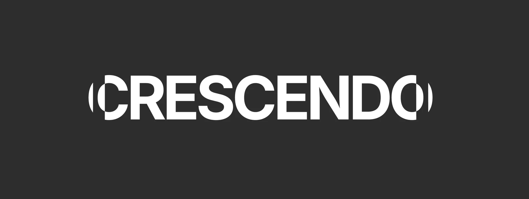
It got killed pretty quickly.
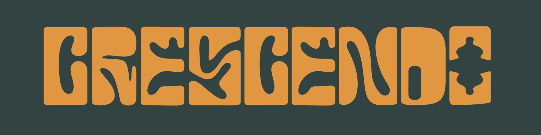
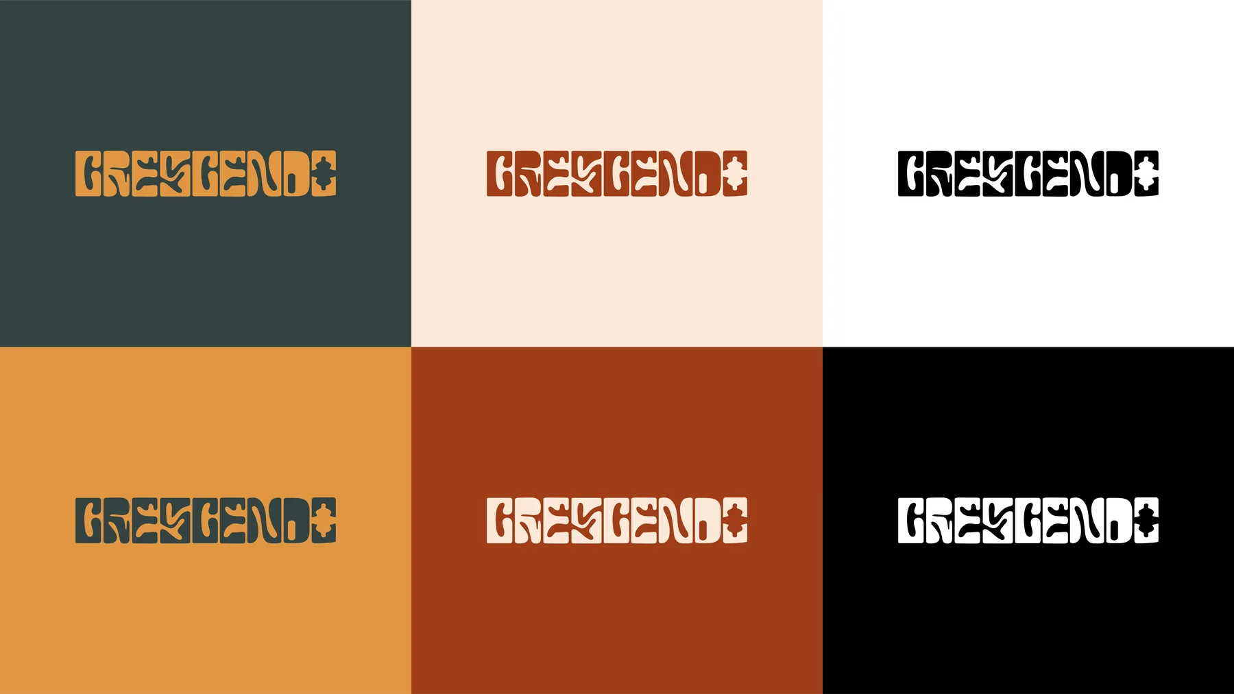
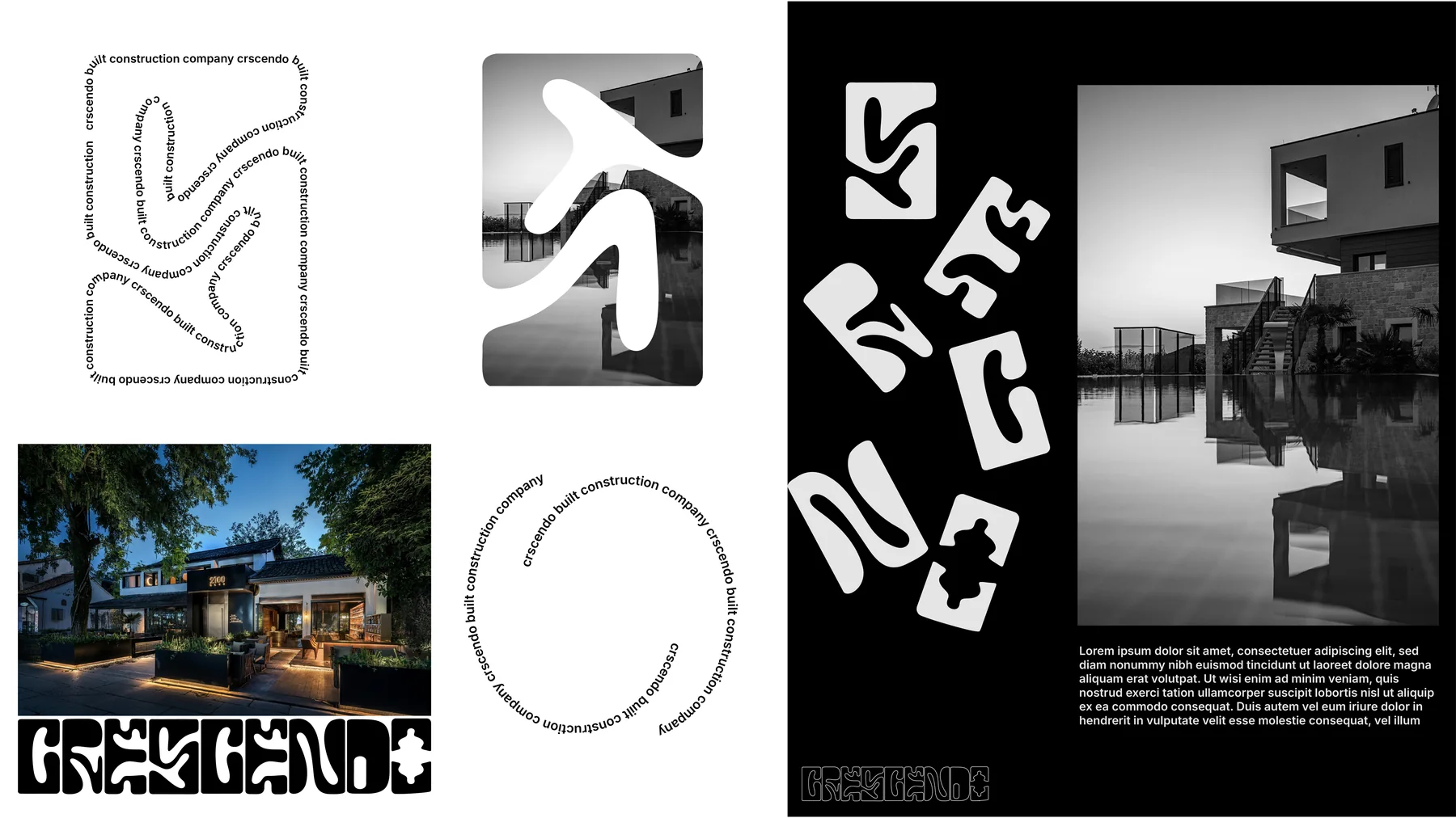
We try to look past the logo and see if what we build can work everywhere the brand shows up in the world.
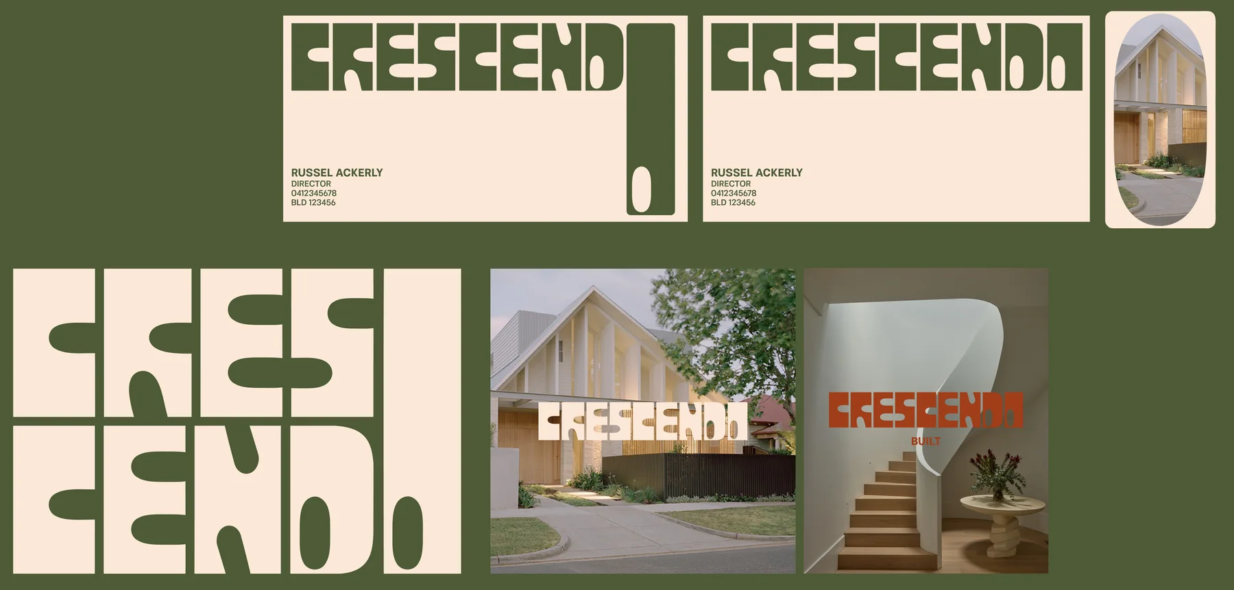
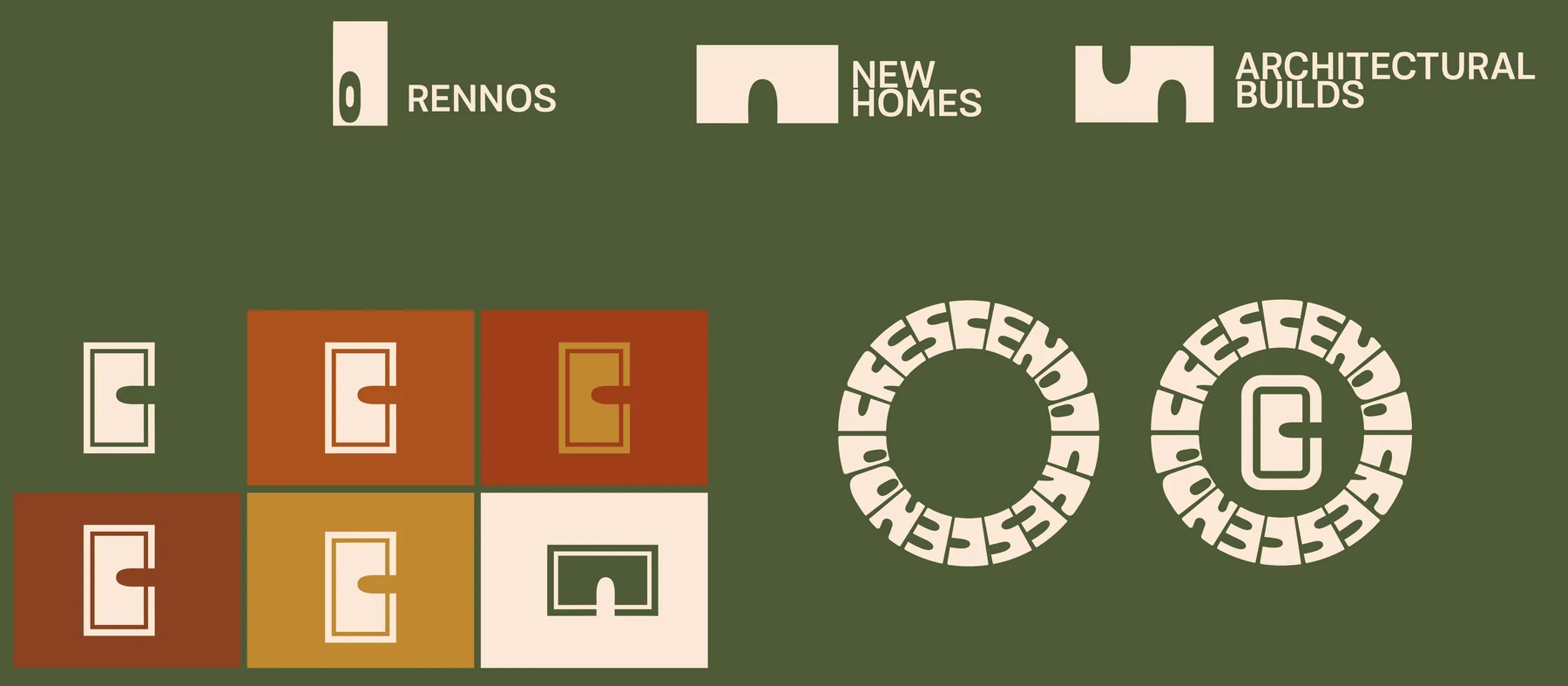
Adding rhythm through the identity with illustrative assets and motifs.
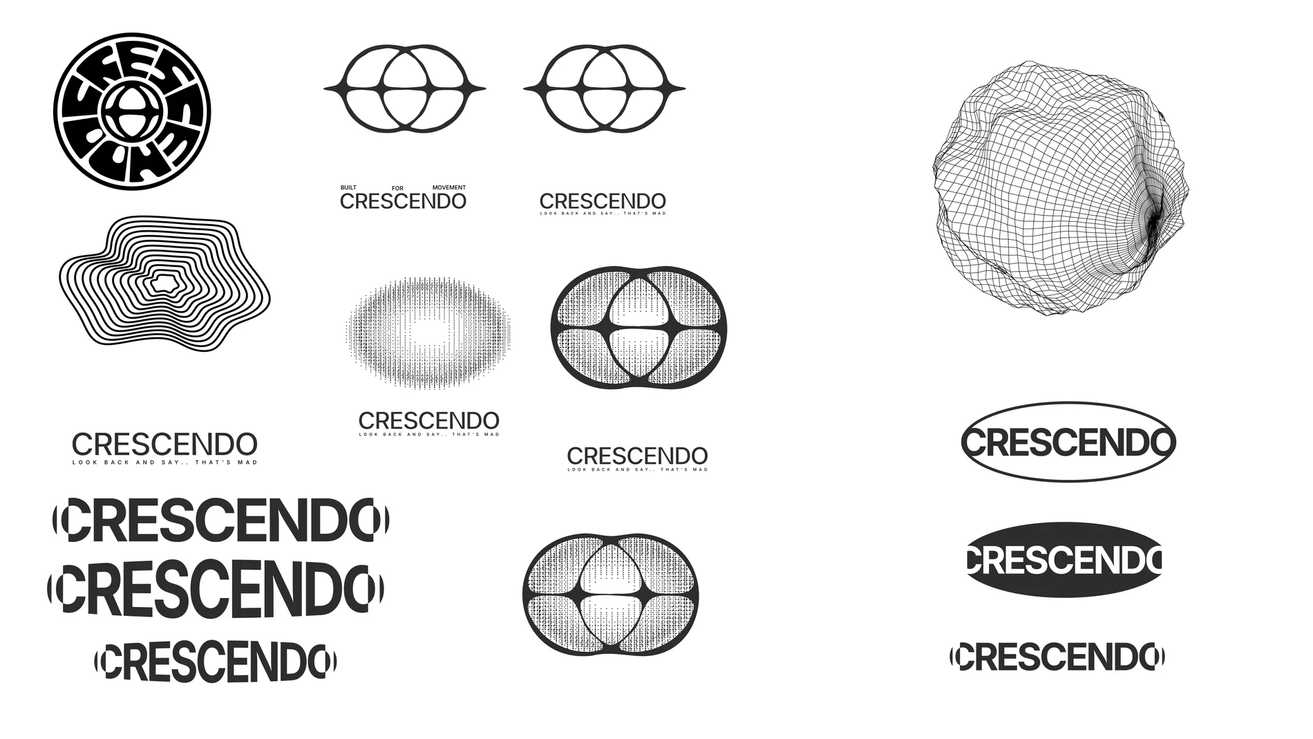

Icon exploration
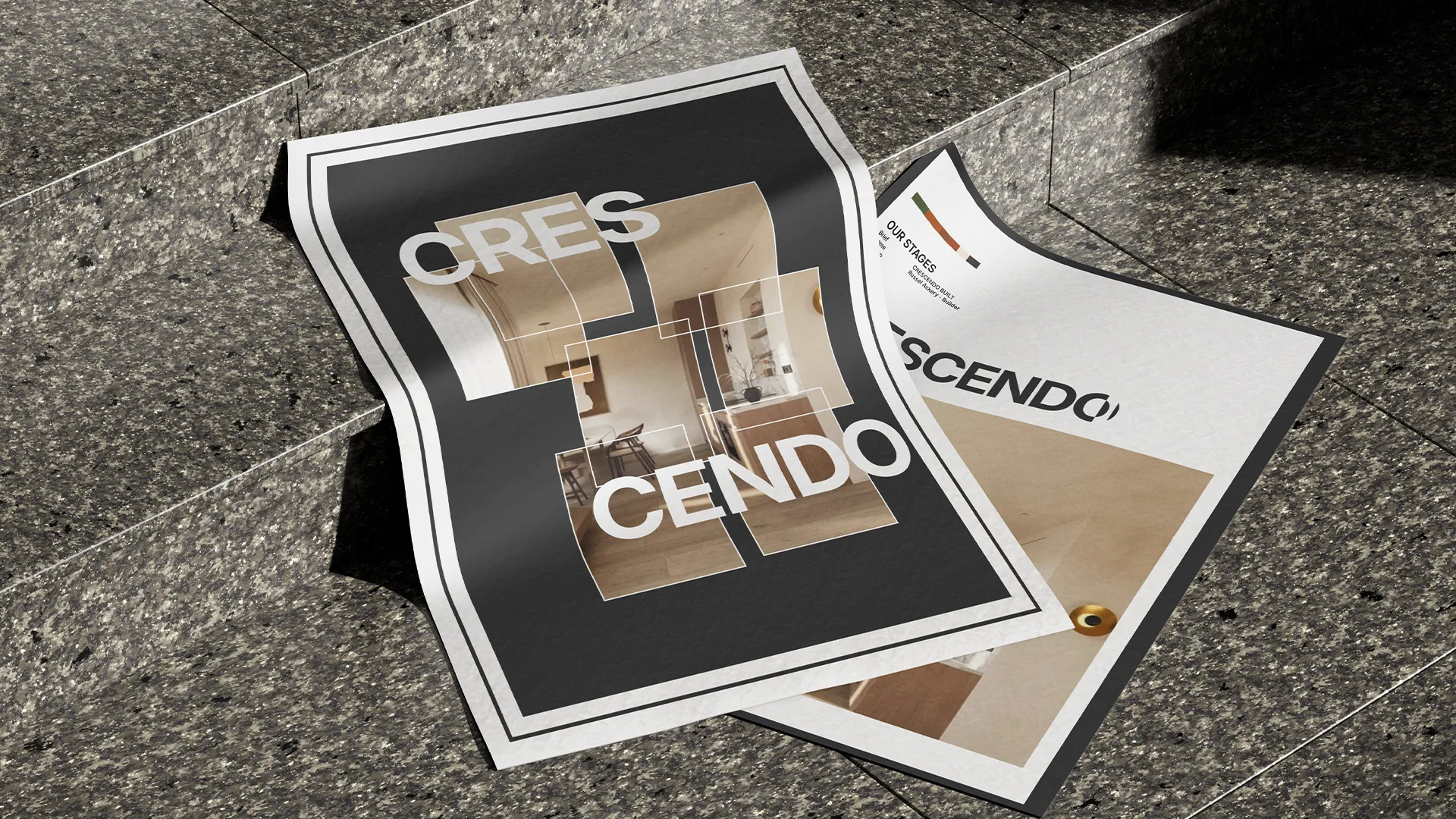
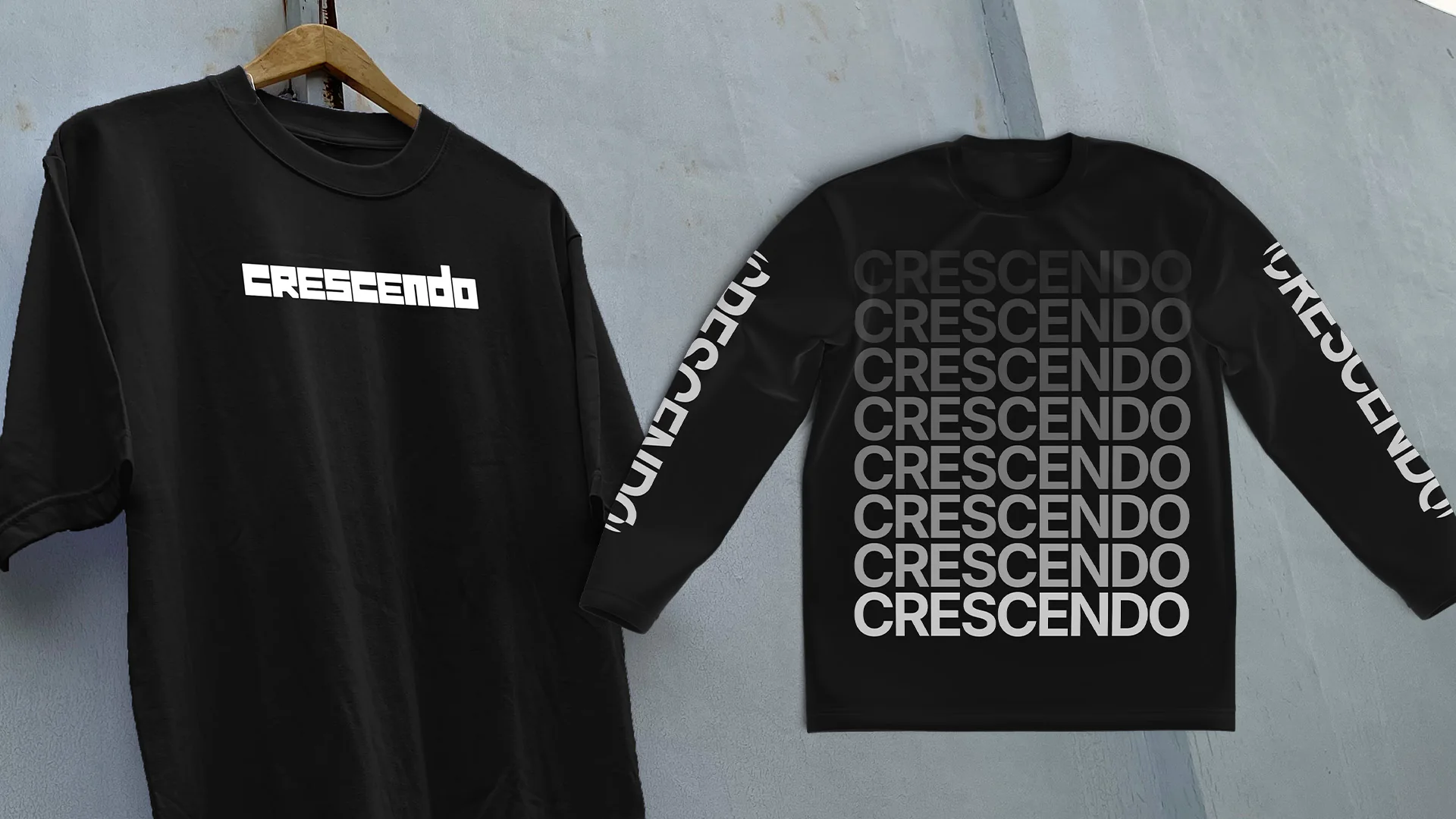
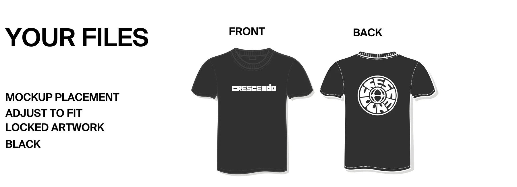
Talk like Crescendo. Short, honest, a bit cheeky. No brochure words.
We like to build homes that we look back on and say.. that's mad.
Construction runs on low margins and big egos. We stayed small enough to avoid both.
Not reinventing the wheel. Just good builds.
Built for movement.
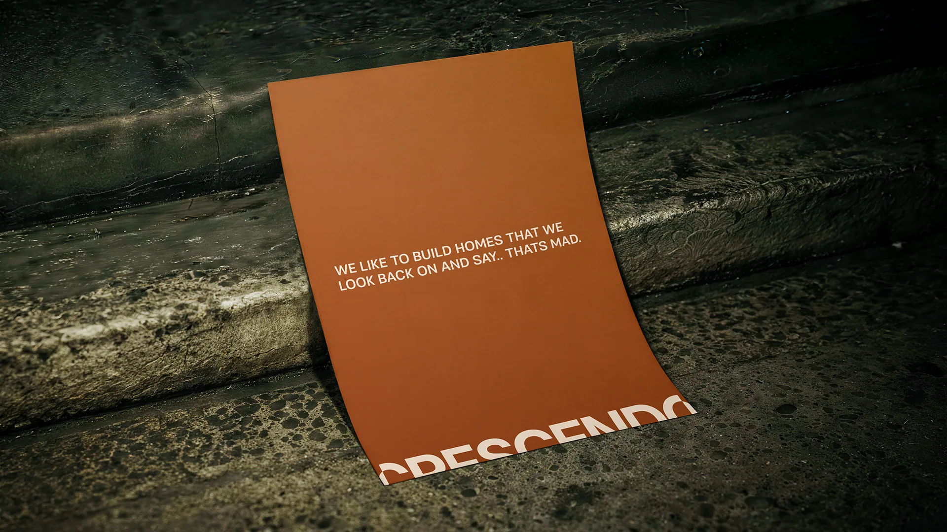
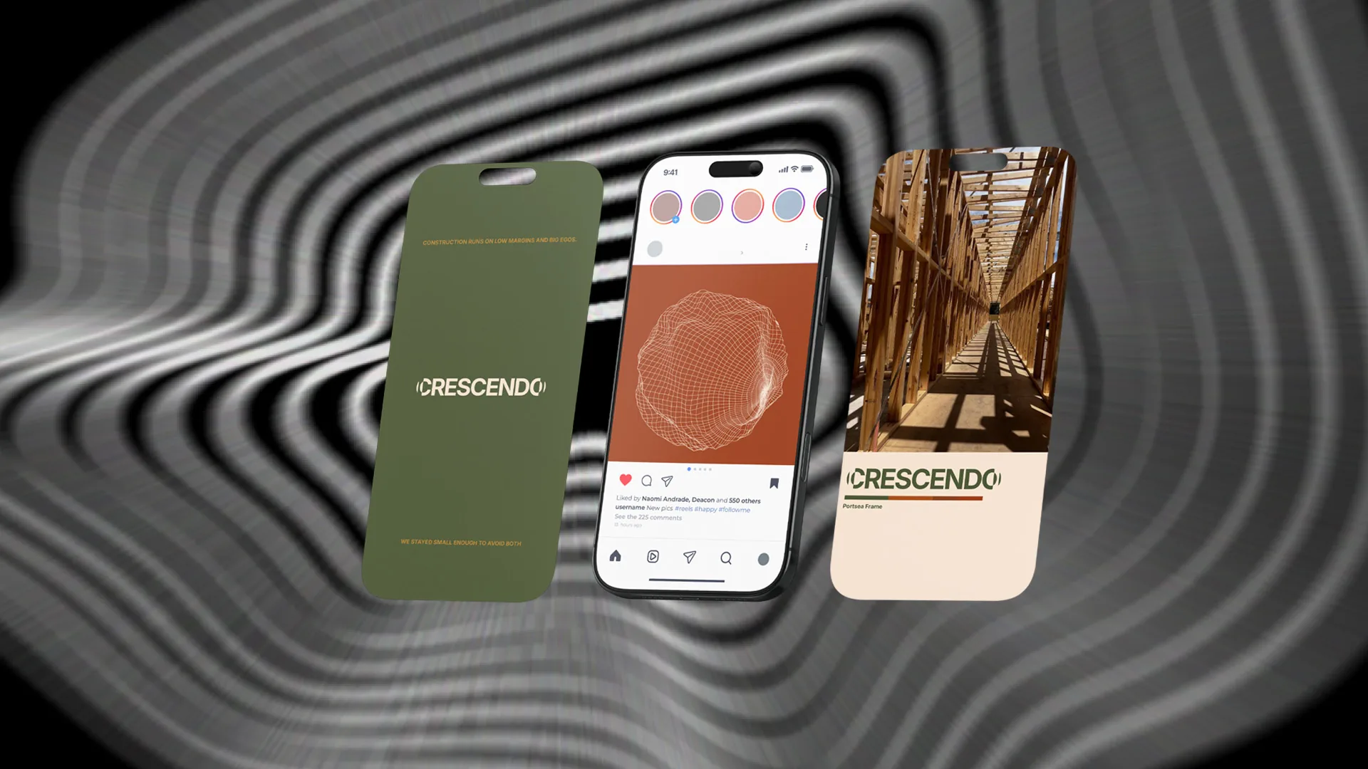
Tap a colour to copy it.
Rhosh Group, Mornington Peninsula
Rhosh Group. Custom homes, renovations and extensions across the Mornington Peninsula. Two mates, Rhys and Josh, running the show.

Rhys and Josh.
Every young builder in their space looked the same. Generic logos, no personality, nothing that felt like real people behind it.


Where they started, and where they landed. Drag it.
Where it started. We asked Rhys and Josh why they came to us.
We just felt like everyone building on the Peninsula had roofs and hammers for logos, or something clean and minimal with no personality. We’re two young guys who started a building company. We want to show we do awesome work, but the Rhosh brand is a true representation of ourselves.
Rhys and Josh, on the discovery call
Rhosh as a lifestyle brand. Not just another building group.
Everyone else in their space was doing boring walkthroughs and only showing the end product. Lifeless. So we built a world around the two of them instead.
High-end builds meet big personalities.
A journey people can follow along.
A story worth connecting to.
Rhys runs the jobs. Josh runs the sites.
Real people, real sites, real banter. The builds are the backdrop, the boys are the story.

The full strategy board. Strategy, world building, creative direction and social. Tap to zoom.
Content built on natural moments. On-site banter, the build, and the merch out in the wild.
Modern where it needs to be. Fun and personable where it has to be.
Boiled down, a non-corporate building company with big personalities doing great builds. Workwear, club merch, bold type and real people on real sites.

The moodboard. Tap to zoom.
Round one. Rough on purpose.
We always try to pair elements together. Things might be a bit rough, but we're always developing the feeling and seeing if every element works with each other.

ExploredCreative direction. Club merch, workwear patches and bold type.

The blanks it all had to live on.
Then we started drawing. Wordmarks, a monogram, badges, a mascot, script lettering, a website and merch, all on one page to see if it worked as a world.

ExploredThe first route. Tap to zoom.
A wordmark with one bar running through the lot, and a monogram built on a strict grid for the tight spaces. Stamps, caps, avatars.
The RG monogram, drawn on its grid.
Two names, one brand. Rhys and Josh, blended into Rhosh.

That idea runs through everything. One bar joins every letter in the wordmark. The hoarding hides their name in plain sight.

The brand already had an existing colour palette that was unique in the space, so we kept it.
Rhosh Blue is Pantone 14-4530. Off Black is Pantone 19-3911. Click a colour to copy it.
BUILT PROPERLY. FINISHED BEAUTIFULLY.
YOUNG.
HUNGRY.
Inter Medium. Body copy.Big Anton headlines over plenty of space. It works on a hoarding, a hat and an invoice.
Their name, hidden in the lettering and wrapped around the site. Hard to walk past.


Gear the boys actually want to wear on and off the tools.


We started from scratch and ended up with a brand as bold as the blokes running it. Young, hungry and doing work worth noticing.
[ How we work ]
Everything you need to know before we start.
11 to 13 weeks, start to finish. Websites add 8 to 10 weeks, usually starting around week 7.

Before anything
We jump on a call and get to know you. Your business, what's not working with your brand and where you want to take it.
Be honest. Tell us the good, the bad and the weird.
A straight answer on whether we're the right fit. We're hectic, so don't waste your time or ours with “we just want a logo, mate.”


Before week 1
Sign the contract and pay the deposit to lock in your start date. Then a quick brief questionnaire and a brand workshop on a video call.
Fill in the brief. Show up to the workshop ready to talk.
Your own project space so you can see where everything's at.
$50% deposit locks in your start date


Weeks 1 to 2
No design yet. We dig into your business, your competitors and your customers. Positioning, messaging, tone of voice and brand personality.
Answer our questions. Send us anything you've got.
The strategy everything else hangs off.
[ Inside a Stories strategy deck ]


Weeks 3 to 6
We turn the strategy into a look and feel. Moodboards and references.
Tell us what hits and what doesn't.
A clear creative direction to build from.


Weeks 3 to 6
Ideas get explored and killed until one earns its place. We chase a unique angle nobody in your space has done before.
Keep an open mind. The weird ones are often the good ones.
A look at just how much we explore to get there.


Weeks 3 to 6
Nothing yet. This is our bit.
The full branding system. Messaging, logo, apparel and anything else we've agreed in the scope.
[ Developing, Hutt Built ]


$25% midway
Weeks 6 to 10
Three rounds of revisions, tightened until it's right.
Give us straight feedback. The more honest, the better it gets.
A brand you're proud to put on everything.
[ Revisions, Hutt Built ]


Weeks 11 to 13
Final files, full brand guidelines and your merch graphic. Then we help bring the brand out into the world the way we made it, so there's no funny business when we see it out there. 👀
Get it out there. Hoardings, signage, merch, the lot.
Everything you need, plus a guide so it stays the brand.


$Last 25% before final files are sent
[ What you get ]
[ Brand identity ]
$15K TO $20K
Any questions, ask us on the call.

[ Stories Design Co ][ About ]
Scroll
[ Who we are ]
Stories Design is a collective of artists, illustrators, designers, strategists and developers who make construction branding exciting.
[ Our sole objective ]


Drag
[ The problem ]
We see a massive problem in the construction industry.
EVERYONE SAYS
THE SAME THING.
EVERYONE LOOKS
THE SAME.
[ Our beef ]
Our beef isn't with tradies. It's with the agencies that have played it safe.
In a world where everyone's competing, the only way to stand out is to build something that doesn't exist yet.
[ Values ]